4 min read
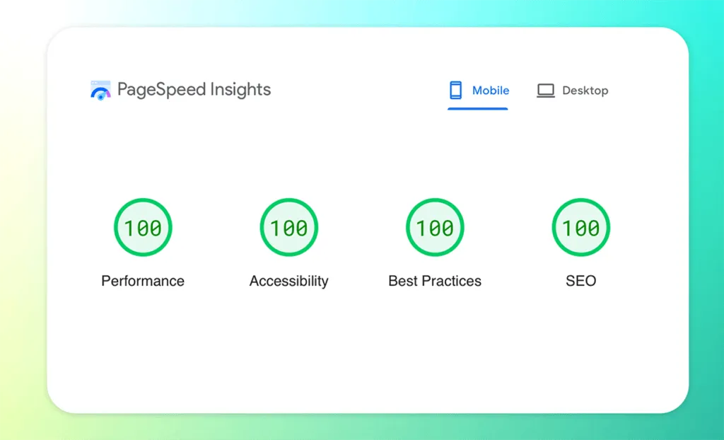
A fast SaaS product website is more than a design project—it’s a performance, content, and conversion system that shapes first impressions. This guide is for founders, product marketers, and developers who want a site that loads quickly, communicates value clearly, and converts without aggressive tactics. You’ll get five practical rules we use at Responsly: performance-first architecture, centralized content, respectful conversion design, distinctive visuals, and good developer experience (DX). Along the way we’ll reference Lighthouse and what to measure, plus how to avoid common “growth widget” traps.
5 rules for creating a great SaaS product website
- Super fast: no place for delays.
- All content in one place: no fractured subdomains and inconsistent UX.
- Conversion without being aggressive: trust and clarity beat pop-ups.
- Well-designed: differentiation still matters.
- Good DX (developer experience): the website should be easy to improve.
Quick checklist: rule → what to measure
| Rule | What good looks like | What to measure |
|---|---|---|
| Super fast | Content appears quickly, interactions are snappy | LCP, INP, CLS, TTFB |
| One content home | One navigation + consistent layout and SEO | Crawlability, internal links, index coverage |
| Respectful conversion | Clear CTA, no “attack widgets” | CTA CTR, form completion rate |
| Distinct design | Recognizable visual system | Scroll depth, time on page |
| Good DX | Fast builds and easy content updates | Build time, deploy frequency |
1) Super fast: choose a performance-first stack
Our marketing site is built with Astro. Before Astro we tested other approaches (and learned where we didn’t want to compromise).
- We avoided WordPress for the frontend experience.
- We tried Gridsome (Vue-based) but ran into ecosystem and hydration limitations.
- We tested Nuxt, but at the time we didn’t hit the performance targets we wanted.
Astro lets us use components where needed while keeping the default output lightweight.
Static-first makes hosting (and performance) easier
Static generation simplifies hosting and reduces runtime variability. We moved from Netlify to Cloudflare Pages. We also recommend using remote tests instead of only local checks.
Lighthouse score: measure it the right way

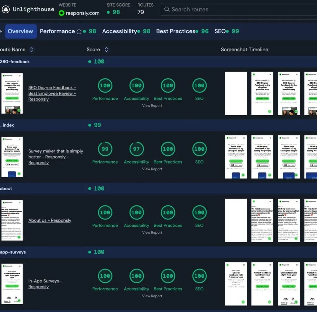
Local Lighthouse runs can be misleading. Use remote checks like PageSpeed Insights. If you have many pages, scan the whole site with Unlighthouse.
2) All content in one place: avoid fractured UX
One of our goals was to keep the product website, blog, and help content under one coherent experience. Switching layouts across subdomains breaks trust and makes learning the product harder.
- Help content is part of SEO.
- Consistent navigation improves discovery and internal linking.
If your website exists to build trust, it’s worth thinking about the customer journey end-to-end. We often tie this back to customer experience and what the visitor needs at each stage.
3) Conversion without being aggressive
Many SaaS sites rely on heavy third-party scripts and intrusive pop-ups. That can hurt both performance and trust.
Our preference is simple:
- Make the value proposition obvious.
- Put a clear call to action (CTA) on each page.
- Let chat be user-initiated (and defer loading if possible).
If you want a conversion system that still feels respectful, consider adding lightweight feedback mechanisms (e.g., a short form or a single-question poll) instead of always pushing chat. Responsly supports this via forms and surveys.
4) Website design: differentiation without reinventing UX
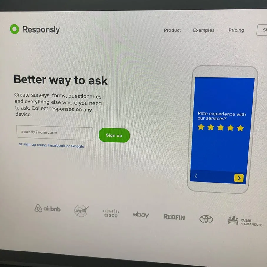
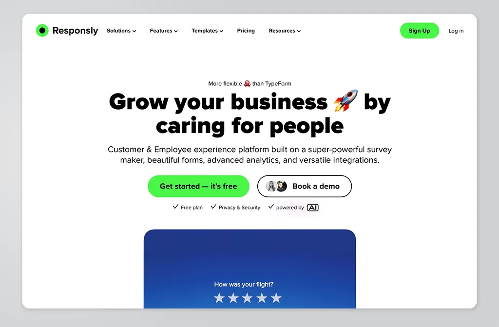
Most modern SaaS sites share common patterns because they work. The differentiator is usually execution: typography, spacing, visual hierarchy, and the consistency of the design system.
5) Good DX for a product website
DX (developer experience) is how pleasant it is to maintain and improve the site. A marketing website is never “done”—so the stack should make iteration easy.
A few DX principles we optimize for:
- Fast builds and deploys
- Clear content workflow
- Reusable components
- Fewer “mystery errors”
We’re big fans of Vue for the app, and pairing Vue components with Astro can keep both performance and DX strong.
Final thoughts
A fast SaaS product website is a compounding asset: it improves first impressions, lowers friction, and makes your product story easier to trust. Start with performance and content architecture, keep conversion respectful, and choose a stack that makes iteration easy.
If you want to add lightweight feedback to your marketing site without slowing it down, explore Responsly forms and quizzes as low-friction ways to engage visitors.


